
News Alert: Email marketing is not dead. Nearly 306.4 billion emails were sent and received each day in 2020. And it’s likely to increase to 361.6 billion by 2024. Not surprising then, emails continue to be a company’s number one touch point with customers and prospects.
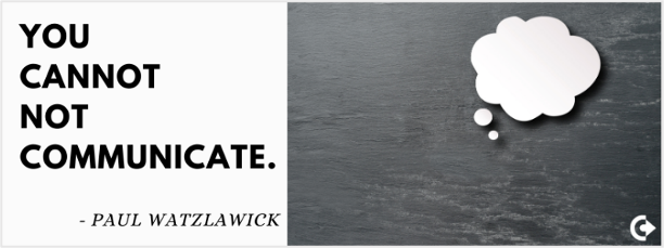
Exactly in this fact – in the sheer number of emails a consumer receives in a day – lies the criticality to make an email stand out. Good copy is an absolute must. Use of relevant images is expected. What else, then, must you do to get your consumer to pause at your email; hear what you want say; do what you want them to do.
The answer is in Design.
Design as Paul Rand says is “method of putting form and content together” such that it communicates the right message – efficiently and effectively. Demanding less time and effort from the subscriber yet making your message sticky.
While there is a lot said and written about good copy, good design – especially in emails is sadly ignored.
IN THIS BLOG
1. Why Design?
2. Email components that influence design and best practices for 2021
i. Envelope Content
ii. Content
iii. Footer & Signature
3. Principles of design and their application in emails
i. A clean and simple layout
ii. Intuitive design
iii. Facilitate brand recall
iv. Effortlessly readable copy
v. Meaningful graphics and imagery
4. Top 3 email design must haves in 2021
Why Design?
Email subscribers follow a 3-second rule. Which means, within the first 3 seconds of peering at your email, the reader will decide whether or not to invest any more time on it.
Let’s look at what’s exactly happening in those 3 seconds. Their eyes fall on the body of the email. Visuals coupled with a few words they glance through send an instant message to their analysing brain. In that limited time, the brain tries to do 3 things.
1. validate relevance to their needs
2. validate authenticity
3. make sense of the message
Good email design, then, works with the clear goal to:
– address EACH of these cognitive needs QUICKLY
– ensure that readers decide in favour of spending more time on your objet d’art
Because when they do spend more time, they read your perfect copy, understand your unique value proposition, and respond to your CTA. Eventually, then, whether or not they act in favour of your CTA is a matter a free will! There’s comfort in knowing that they are taking an informed decision – thanks to your email design.
The goal of every email marketing campaign is to make this journey of 3 seconds to 3 minutes (or more) effortless and value-adding for the subscriber. Good design ensures you’re at the driving seat and steer your reader’s attention to the right place, at the right time.
Email components that influence design and their standard best practices
Each component of your email, its content and design, and flawless coding combine to form a complete email experience for your customer. It’s important you give each of them your attention such that it communicates something that’s right about your brand. Your out of the box thinking. Your eye for detail. Or your fun work culture.
i. Envelop content
It’s the envelop content that answers the first 2 questions in your reader’s mind. “Is the message relevant to me?” and “Is the brand legit, professional and expert in its field?”. A 2019 Litmus study revealed that the 3 components of your email envelope combine to convince your subscriber to open that email and give it a gander.
Good design begins at optimizing the envelop content.

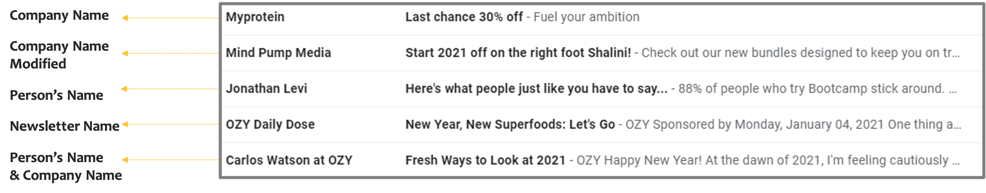
a) Sender Name text conveys trust and answers the question, “is this email genuine?”. Some tips:
– You can keep it simple by using the company name – common but easy to identify with; or include a person’s name. But you MUST ensure that the sender name displays a real name – company’s or employee’s – not an email address.
Including a person’s name is a good idea if that person has an updated and a strong social media presence.
– Use segmentations for different types of emails. For example. “Orders at Company” for transactional emails; “John from Company” for newsletter; and “Sale at Company” for special offers. Just ensure you stay consistent to help your subscribers categorize them. Consider playing around with the options below. But, we repeat, stay consistent.
b) Subject should be attention grabbing, informative, and short. Your readers will spend less than a second here. If they don’t understand or care about what you’re saying, your email will tumble to the TRASH can.
Considering the character limits set by email providers and mobile audience, try to limit the subject line to 50 characters or less to avoid it from being truncated.
c) Pre-header text is the summary text immediately after the subject line and is used by email clients to prime readers about the main content. It’s a rather popular trend as many email clients like Gmail, Outlook, and the iOS mail app allow you to show snippet or preview text.
To truly leverage this feature, consider these practices.
– include a pre-header text. Leaving it out may mean you allow email clients to clutter it with unrequired content compromising your screen space
– don’t simply repeat the subject line, write relevant text
– limit text up to 85-100 characters
– craft them such that they stand out and pique reader interest – for example add a short summary at the very top of the email design
– make the subject line and pre-header work together. For example, by using the question-answer technique. Subject line in question format and answer in the pre-header. Or vice versa
– adding the Call to Action can work in your favour too if used well
– personalize, wherever possible

ii. Content
In all likelihood, you are paying ample attention to this one. In case you’re tempted to give it a short shrift, do remind yourself that your consumers view emails as a more personal tool than social media. A good marketing email, therefore, carries content that talks directly to your consumer’s needs and in a language s/he knows. This deep connect demands personalization of content.
Using subscriber name is a good start. A HubSpot report shows that emails including the first name of the recipient in the subject line have far higher clickthrough rates than those using subject lines without the recipient’s name.
Segmenting subscribers, that is dividing your subscriber list into different groups based on common characteristics is another easy and effective strategy to bring in personalization. For instance, you might classify groups on the basis of their demographics, or age group, or interests they’ve shown on other platforms.
Emails with personalized subject lines turn out to be opened 26% more often and segmented campaigns lead to an increase in revenue by 760%. – Campaign Monitor
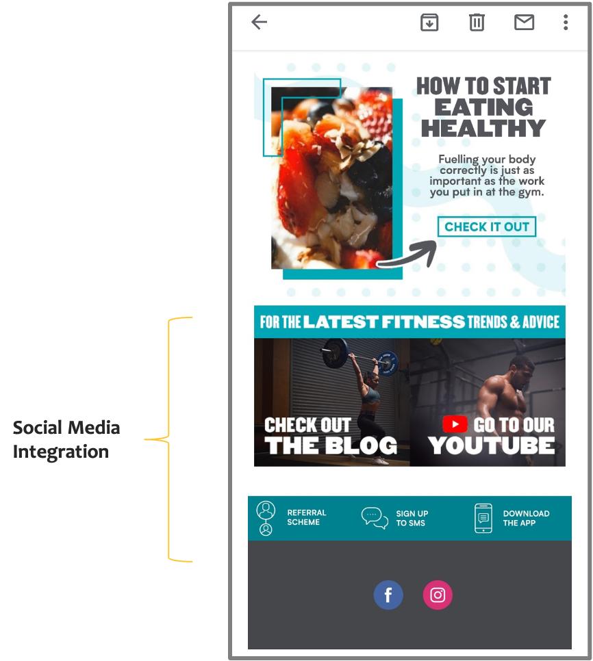
Another content best practice you must stick to in 2021 is to ensure that your email design enables social media integration. Provide links to your company’s social media assets in the email. It is one of the easiest ways to integrate your social media marketing with your email campaigns. Even though it seems obvious, make it a standard practice to insert social icons on your unsubscribe page; “thanks for signing up” page; recurring email newsletters; auto-responders and official mail signatures.
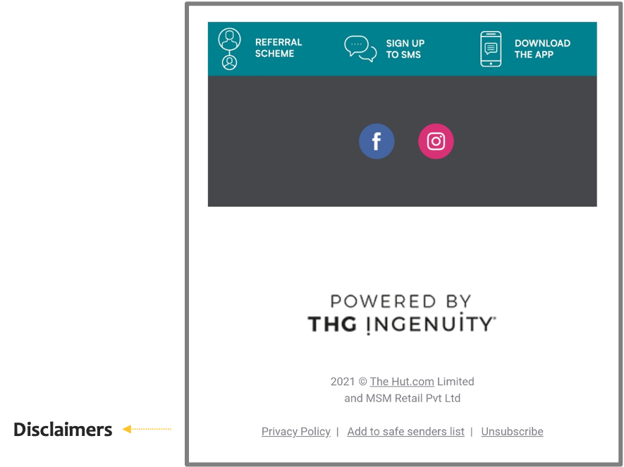
iii. Footer & Signature
Your signature is not the place to express your sentiments on the environment nor your most favourite inspiring quote. Basic ground rules here include:
– avoiding images in signatures – subscribers may have trouble adding images
– sticking to text and maybe links
– keeping them consistent with other signatures in the company, standard format, fields, and fonts.
In the footer, include your organization’s contact details, links to main segments of the website, key services or products, and social sharing or “forward to a friend” buttons. Another significant addition to the footer is a, “Why are you receiving this email?” and the unsubscribe button. This will reduce chances of your emails going to spam folders.
The introduction of block functionality by email clients like Gmail empowers subscribers to “block” a sender. Too many blocks can be detrimental to your sender reputation.
Principles of Design and their application in emails
Remember the third activity your reader’s brain is pacing to complete in 3 seconds? It’s trying to make sense of your email. Hence – keep it simple and quick to understand. Put your emails through a 3 second glance test.
Once ready – show your email to a few people for 3-5 seconds and then ask them what the email is basically about. If their answer is vague and all over the place, you’ve got some decluttering to do.
Adhering to basic design principles in your email will ensure you pass that glance test. The list below outlines the principles and best practices you can follow as you deploy them in your email.
i. A clean and simple layout
– Ideal email width is 500 to 650 pixels
– Vertical layout is preferred over a horizontal one – use horizontal separators (visible or invisible) to create clean lines between sections
– Design with white space
– A navigation bar is good if you have multiple products or categories to display
– It’s advisable to limit yourself to four or five sections for better visual emphasis – even if you’re offering retail solutions
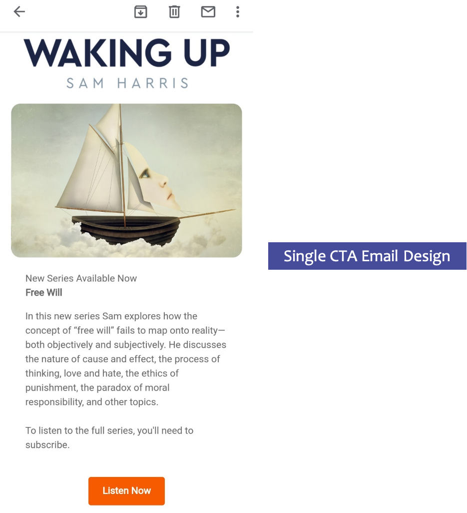
– It’s a good idea to stick to a layout that draws focus on one thing ONLY and offers ONE call to action only. Your reader’s brain can’t really process more than that while reading your email and eating their sandwich. Research backs our advice as emails with single CTA showed increase in clicks by 371%.
ii. Intuitive design
Good design is intuitive. This means it is grounded on natural human tendencies to view, understand and synthesize information. Tools of visual hierarchy use make comprehension easier. And every single aspect of design like placement, size, colour, contrast, fonts play a role in establishing visual hierarchy in your reader’s mind. More on this…
– We naturally consider large, conspicuous items as more important. Hence, big fonts and larger images carry important information.
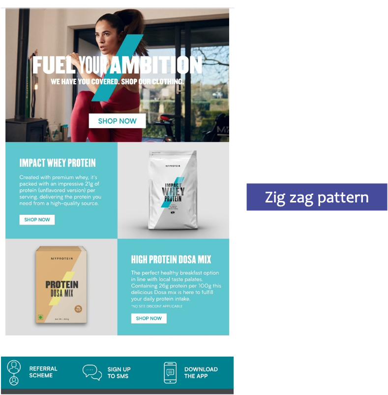
– Natural eye movement is top to bottom and left to right – structure information such that important information is higher up on the page. Using patterns like zig zag (or Z) and inverted pyramid help mimic the eye movement in your email design.
– After navigating through your mail, your reader is naturally left with the question, “what can I do about this?”. Answer this promptly by ensuring your design guides the reader towards the CTA.
– Use the CRAP principles of designing for better visual emphasis and to aid quick understanding

iii. Facilitate brand recall
– Use brand colours and fonts in every single campaign
– Create a template – consistency in layouts and visuals communicates trust and reliability
– Don’t repeat every single part of the layout – that would communicate laziness; fuse creativity with your branding guidelines
“Not enough talk about the importance of brand in email. Customers don’t sign up for email — they sign up for your brand.” — Bob Frady, CEO HazardHub
iv. Effortlessly Readable Copy
– Use short sentences and paragraphs
– Use spacing and dividing lines to separate content sections
– Add line breaks every 60 characters even in your plain text emails
– Use bullets
– Use web-safe fonts like Arial, Arial Black, Arial Narrow, Comic Sans, Courier New, Georgia, Impact, Tahoma, Times New Roman, and Verdana
– Safe font sizes are 14 pixels or more for body of the email and 22 pixels or more for title
– Plan email content based on inverted pyramid
Ensure your copy is succinct. Edit, re-edit, and some more. If you don’t edit, your reader will. Not your ideal CTA!
v. Meaningful Graphics and Imagery
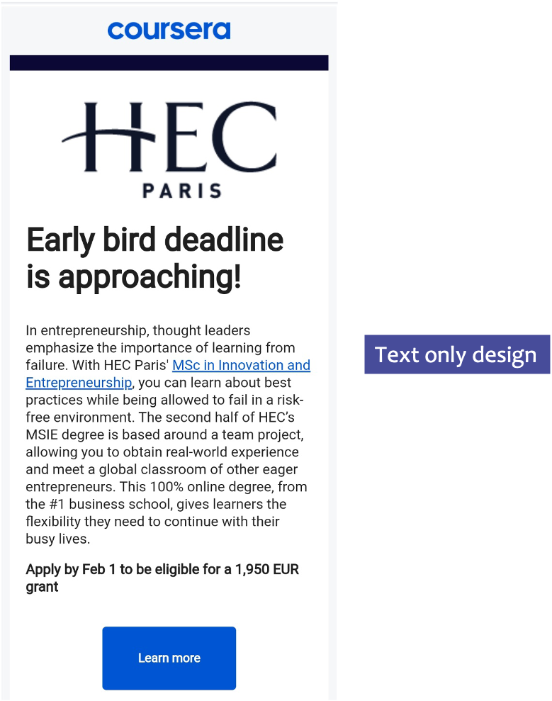
– Experiment with text only emails or text-based graphics, in interest of simplicity
– Use visuals like icons, infographics or short embedded videos
– Provide fallback colour and alt-text for the image
– Avoid background images layered behind text. Many email clients (such as Outlook) do not support background images
– Do not squish or stretch images to resize images
– For fluid emails, scale images up to 599 pixels
– Make feature headers or product offers easily clickable in the email template
– GIFs are a good way to add an element of interest to your email

Top 3 Email Design Must Haves in 2021
i. Embrace hyper-personalization
In a world where hyper-personalization is the order of the day, personalization in email is more than using your subscriber’s first name. Sometimes, it may mean displaying the credit balance or points earned to nudge them to shop more. And sometimes it may mean using AI, fetching data from other platforms to customize your campaign to the exact behaviours and patterns of your subscriber. Let’s say by setting up an abandoned cart series to snag that potential customer who’s probably forgotten to click ‘PAY’.
Naked Wine – online wine community and e-commerce store – relies on customer reviews to personalize wine tasting and buying experience. Customer rating on wines they’ve consumed or recommended; feedback and transaction data is combined to personalize email campaigns. Outcome – improved email engagement and campaign conversion rate by 40%.
The ability to send hyper-personalized, dynamic content based on user’s interests and behaviour is a trend that’s here to rule in 2021 and is likely going to around for a long time to come.
ii. Interaction = Engagement
Luckily, email marketing makes directing interactive content to a consumer’s inbox rather simple and low cost. Basic skills at embedding HTML and CSS using an email editor is enough to get you started.
Instead of sending a subscriber to your landing page right away, provide interactive content within the body of the email. This could mean including one or more of the following.
– Built-in Surveys and questionnaires
– Offers
– Animated buttons and call-to-actions
– Hamburger menus
– Product carousels
– Rollover effects on products and offerings
– User-generated interactive content
– Accordion features
– Add-to-cart
More interactive also enables you to integrate other channels into your digital marketing. For instance, if you share a video in an email, you might use social media share buttons to encourage others to share the video content on their own social media pages. The more integrated you can make your marketing campaigns, the more touchpoints you’ll create within your target market.
iii. Leverage user-generated content (UGC)
Adding UGC is a definite and proven trend that’s been adopted well and successfully in Email Marketing. Adding created by existing customers help show products/service in real settings and bump up brand credibility. Testimonials and reviews are a good place to start. You can also put together a small, fun contest around consumers sharing their images and videos. Place a small prize or a discount to encourage participation. Select the good quality ones, seek permission from your consumers, and voila! You’re ready to add it to your email.
In terms of design, it’ll help if you give your users some simple and clear guidelines to their content aligns with your design practices. For example:
– Share a photo or video drinking BeanThere coffee while working!
– Click a close-up photo or shoot a video of your hand the next time you’re wearing one of the TITAN RAGA watches.
– Run-of-the-Mile Shoes and Hiking. It’s a match made in heaven! Click a photo with you wearing one of our collections on your favourite hiking trail and share it with us.
In Conclusion
You, me, and our competitors. The good ones and those we don’t consider a worthy match. There’s one question we’re all trying to answer. What’s that one trick in our digital marketing hat that will get our consumer to stay with our content a little longer?
At CTC digital, we believe the answer lies in that harmony between good content and thoughtful design. This has enabled us to meet targets, build long-lasting relationships, and convert more people into paying customers and brand advocates. Start by giving design a serious thought and bring some of these easy to implement best practices in your emails. Pronto!


Leave a Reply